reading-notes
Read: 14a - CSS Transforms, Transitions, and Animations
CSS Transforms
The transform property applies a 2D or 3D transformation to an element. This property allows you to rotate, scale, move, skew, etc., elements.
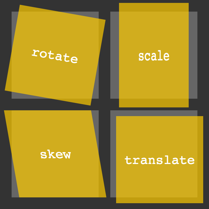
2D Transforms 2D Rotate
HTML<figure class="box-1">Box 1</figure>-
<figure class="box-2">Box 2</figure> CSS.box-1 {transform: rotate(20deg);}.box-2 {transform: rotate(-55deg);}
2D Scale
HTML<figure class="box-1">Box 1</figure>-
<figure class="box-2">Box 2</figure> CSS.box-1 {transform: scale(.75);}.box-2 {transform: scale(1.25);}
2D Translate
HTML<figure class="box-1">Box 1</figure><figure class="box-2">Box 2</figure>-
<figure class="box-3">Box 3</figure> CSS.box-1 {transform: translateX(-10px);}.box-2 {transform: translateY(25%);}.box-3 {transform: translate(-10px, 25%);}
Transform Origin
The transform-origin property allows you to change the position of transformed elements.
2D transformations can change the x- and y-axis of an element. 3D transformations can also change the z-axis of an element.
div {transform: rotate(45deg);transform-origin: 20% 40%;}
Perspective
The perspective property is used to give a 3D-positioned element some perspective. The perspective property defines how far the object is away from the user. So, a lower value will result in a more intensive 3D effect than a higher value.
#div1 {perspective: 100px;}
3D Transforms
3D Rotate
transform: perspective(200px) rotateX(45deg);transform: perspective(200px) rotateY(45deg);transform: perspective(200px) rotateZ(45deg);
3D Scale
* transform: perspective(200px) scaleZ(1.75) rotateX(45deg);
3D Translate
* transform: perspective(200px) translateZ(-50px);
Transform Style
The transform-style property specifies how nested elements are rendered in 3D space. Note: This property must be used together with the transform property.
div {transform: rotateY(60deg);transform-style: preserve-3d;}
Transitions and Animations
CSS Transitions: CSS transitions allows you to change property values smoothly, over a given duration.
transitiontransition-delaytransition-durationtransition-propertytransition-timing-function
How to Use CSS Transitions? To create a transition effect, you must specify two things:
- the CSS property you want to add an effect to
- the duration of the effect
Note: If the duration part is not specified, the transition will have no effect, because the default value is 0.
div {width: 100px;height: 100px;background: red;transition: width 2s;}
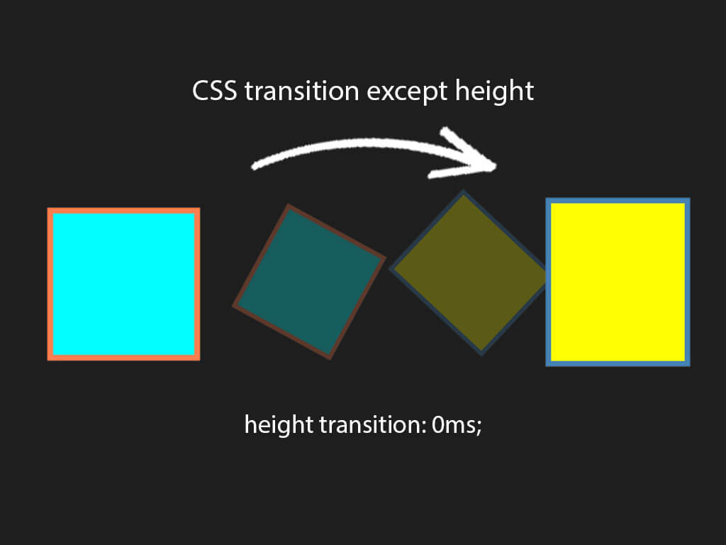
Change Several Property Values The following example adds a transition effect for both the width and height property, with a duration of 2 seconds for the width and 4 seconds for the height:
Examplediv {transition: width 2s, height 4s;}
Specify the Speed Curve of the Transition
The transition-timing-function property specifies the speed curve of the transition effect.
The transition-timing-function property can have the following values:
ease- specifies a transition effect with a slow start, then fast, then end slowly (this is default)linear- specifies a transition effect with the same speed from start to endease-in- specifies a transition effect with a slow startease-out- specifies a transition effect with a slow endease-in-out- specifies a transition effect with a slow start and end-
cubic-bezier(n,n,n,n)- lets you define your own values in a cubic-bezier function Example#div1 {transition-timing-function: linear;}#div2 {transition-timing-function: ease;}#div3 {transition-timing-function: ease-in;}#div4 {transition-timing-function: ease-out;}#div5 {transition-timing-function: ease-in-out;}
Delay the Transition Effect The transition-delay property specifies a delay (in seconds) for the transition effect. The following example has a 1 second delay before starting:
Examplediv {transition-delay: 1s;}
Animation
CSS allows animation of HTML elements without using JavaScript or Flash!

CSS Animations An animation lets an element gradually change from one style to another. You can change as many CSS properties you want, as many times you want. To use CSS animation, you must first specify some keyframes for the animation. Keyframes hold what styles the element will have at certain times.
Animation properties
@keyframesanimation-nameanimation-durationanimation-delayanimation-iteration-countanimation-directionanimation-timing-functionanimation-fill-modeanimation
8 simple CSS3 transitions that will wow your users
- Fade in
- Change color
- Grow & Shrink
- Rotate elements
- Square to circle
- 3D shadow
- Swing
- Inset border